02 — Brand Story
OUR STORY
"Flipside started the same way it does for most people — we were sick of energy drinks that hit hard, then disappeared just as fast. The spikes. The crashes. The jitters. The comedown. It never made sense to us."
So we decided to build the other side of energy. Something clean, smooth, and steady. Energy that keeps you switched on without burning you out.
— Troy & Adrian, Co-founders
BRAND MISSION
Clean, smooth, steady energy without the crash. No spikes, no jitters, no comedown.
NO CRASH.
NO B.S.
Welcome to the Flipside.
⚗️
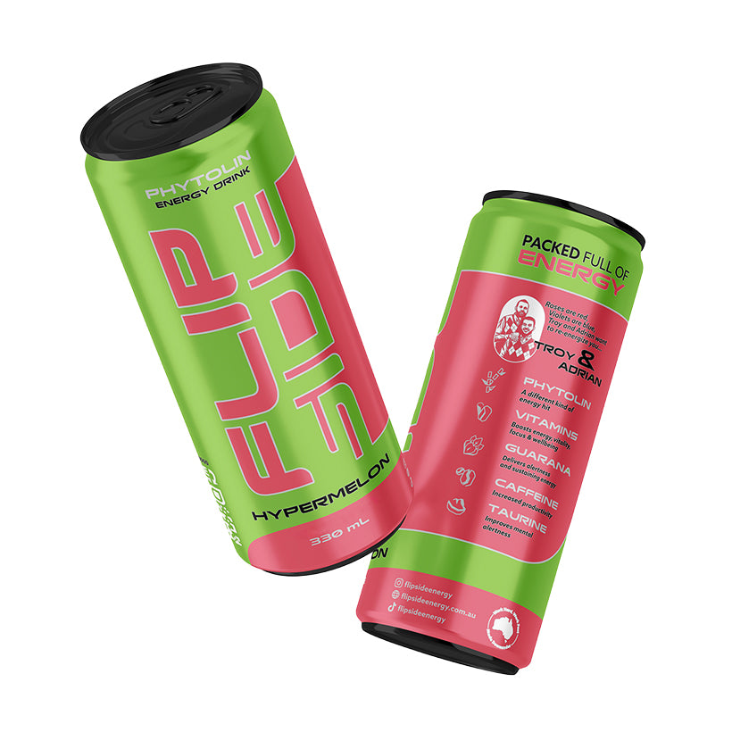
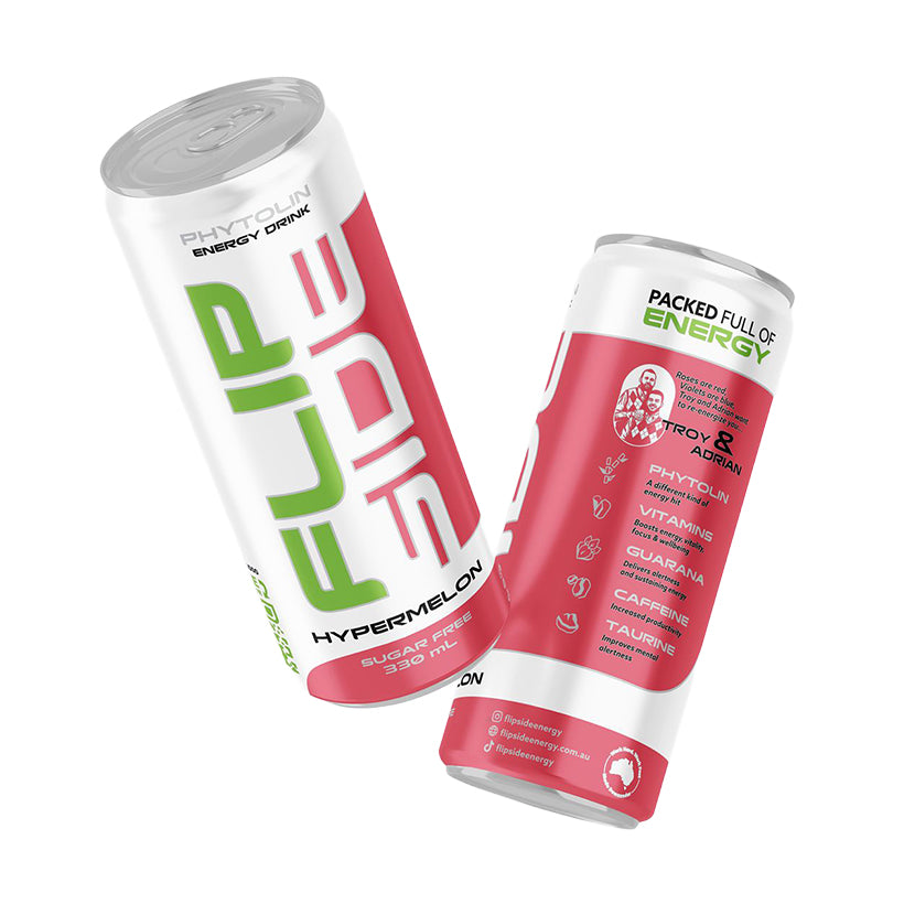
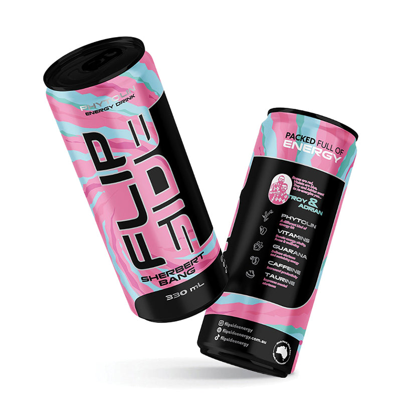
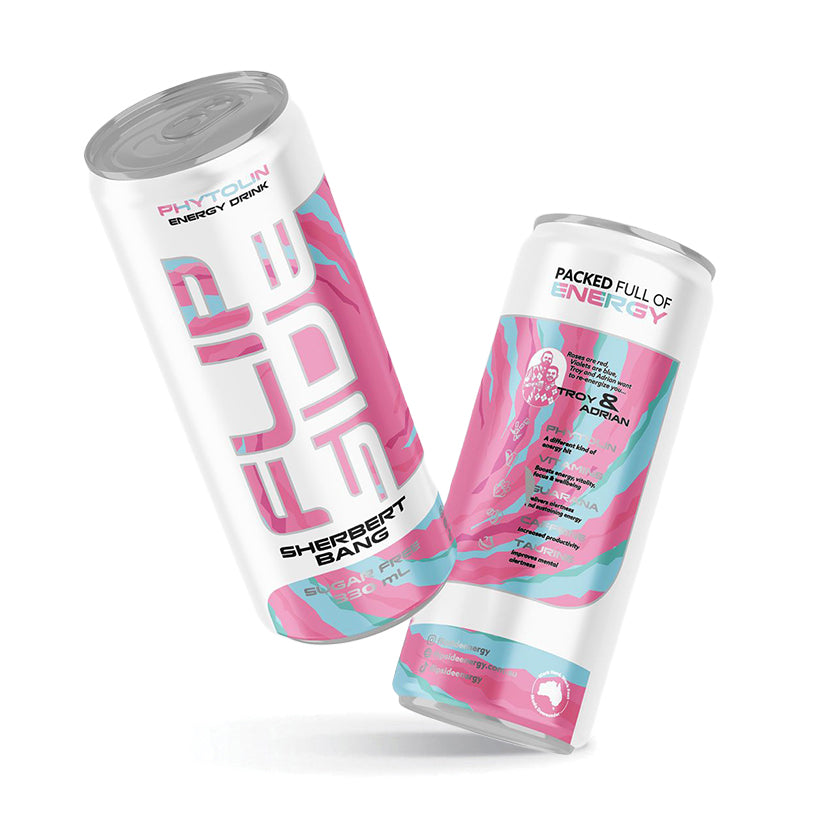
Clean Ingredients
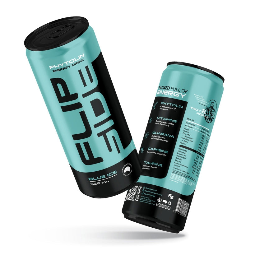
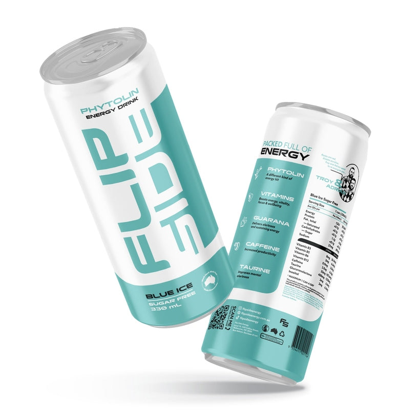
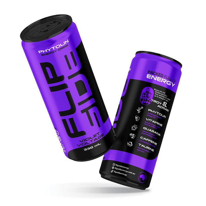
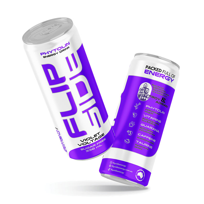
Phytolin, Caffeine, Guarana, B Vitamins, Taurine
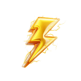
⚡
No Crash
Smooth, steady energy all day
🍹
Great Taste
4 flavours, sugar-free options
🦘
Aussie Made
Authentic, local, real people
🤙
Community
FLIPPY FAM, UGC-driven


11 — Social Media
SOCIAL GUIDELINES
Platform Handle
@flipsideenergy
Instagram · TikTok · Facebook · Twitter/X
Primary Hashtags
📱 Stories / Reels
Vertical 9:16 format. Bold text overlay using display font. Flavour background colours. Fast cuts, high energy music. UGC encouraged.
📸 Feed / Grid
Colourful, high energy. Alternating product shots and lifestyle content. Consistent colour treatment across flavour ranges. Bold crops.
🤙 Community (FLIPPY FAM)
Repost UGC with credit. Engage in comments with brand voice (direct, fun, Aussie). Celebrate the community. Make people feel like insiders.
📝 Caption Style
Short punchy sentences. Lead with the hook. End with CTA or hashtag. Maximum 3–4 lines before the hashtag stack. Match the energy of the image.
FLIPSIDE
Instagram
Feed 1:1
FLIPSIDE
TikTok
Video 9:16
FLIPSIDE
Facebook
Post 1.91:1
FLIPSIDE
Twitter/X
Card 16:9